Friend Signed Up App Design
Sometimes I like to participate on a Design Challenge to solve problems quickly and effectively in a short period of time, that helps me to be ready for fast speed projects and also practice for future interview projects.
Here I present my approach. Please, have in mind that the entire process took me about 10 hours of work, including research, design and testing.
To complete the task I used the inter n et to work with the secondary research (software benchmark) and "usertesting.com" to run my surveys and moderate interviews for the primary research. The design and prototyping was made with Sketch and Invision. Finally, I tested the prototype with five users using an unmoderated testing on usertesting.com.
My approach:
Understand the problem → Research → Prototype → User Test → Improve (repeat).
Case Study: an app to meet friends
Design a product that serves to make and meet new friends in your city, who are close to you. This product will be monetised with the visibility of the users. Their target is women between 25 and 35 years. The launch country is Spain.
Problem
Currently there are more and more young professionals living in cities where they feel isolated or with small social circles. There are applications for dating or "meetups", but not a product focused on women looking to make female friends. A new app will help busy Millennials find new friends in their own city or in a new one. This app will allow you to make connections with like-minded people in a convenient, fast and totally online way.
Research
After defining the problem we face, we need to emphasise and understand our potential users. In order to do that, we will start with a competitive analysis to see what is the market offering at this point of time. Later, we will run a series of user surveys to know how this app should look and feel.
1. Competitive Analysis
In order to have a little view of the market we were investigating and testing several applications, among them I would highlight Meetup, Coachsurfing, Bumble or Happn. We will say that the first is to attend events or "gatherings" with a common theme and the second to meet people who allow you to sleep on your couch. The other two are apps are used for Dating even if they try to sell the idea that they are to make friends.
Bumble BFF would be the most similar application on the market, but is open to all genders. There is no application in the market only for women looking to make girlfriends in their cities. We want to create an app for girls only.
2. User Surveys
We will use this technique that will help us detect the most important pain points. Learning about what barriers these women encounter in order to make new friends will help us find a solution to our problem. Working with real qualitative and quantitative data helps us not to work with intuition, but with real data. If we get clear and honest information, we will recognise the root of the problem and so we can solve it.
To carry out the interviews we use a tool called "www.usertesting.com", they have their own panel and you receive answers immediately.

User Panel (10 Surveys)
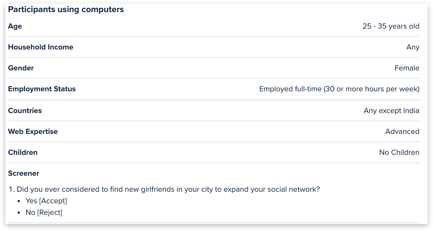
In a real study we would conduct more surveys, but in this case we will limit ourselves to 10 women. They live in cities, between 25 and 35 years old, working and without children. We used a filter question that was the following: Did you consider looking for new friends in your city to expand your circle of friends?
Quantitative Results
To the questions:
Have you ever felt socially isolated in your city?
Have you thought about expanding your social circle in recent years?
All women answered YES.
To the question:
Would you be more interested in meeting friends who are men or women?
All women responded that WOMEN.
To the question:
If you want to meet new friends, what would be more important to you, PROXIMITY or COMPATIBILITY?
80% answered Compatibility and 20% Proximity.
To the question:
Would you pay a small amount of money for the application here presented?
60% said they would not pay and 40% would pay.
Qualitative Results
To the question:
What kind of girls would you like to meet?
Girls who enjoy doing things similar to me: going out and having coffee, trying new restaurants together, going to church together, exercising together, COMMON INTERESTS.
To the question:
What does an application need to meet new friends to start using it?
A messaging function where we can send messages and memes, photos and videos. A map that shows where people are in relation to me. A filter function so you can filter people who are not going to be very compatible and the ability to view their social networks.
Clear distinction of dating applications. Possible ways to meet people (like meetups) or activity ideas. I don't want to "slide" to "match", it must not be Tinder.
You need to have some sort of selection process so that I can connect only with those people who match my preferences instead of searching all random profiles. I'm looking for compatibility.
To the question:
If you had a magic wand, the perfect application to meet new friends would be …
An app with the ability to join personality types. Images for the profile, list of interests, ability to create events and share them.
An easy-to-use application that connects women of different age ranges and by city. This application allows women to connect and build friendships or networks in several ways.
Hypothesis
We believe that creating a mobile application called Frenzy, a simple and easy app that allows young women to make COMPATIBLE friends near their LOCATION, will be useful for these millennials to feel socially integrated. The success of this application means for us a high number of ACTIVE USERS that will provide us with interest on the part of the advertisers that will be the ones that will pay the cost of producing the application.
User Persona: Meet Rita
Features for an MVP
After the quantitative analysis we can say that our target wants an app for WOMEN to WOMEN. The most important thing is that among these women there is COMPATIBILITY and that they are NEAR.
The most desired features are:
- MESSAGING SYSTEM where to send messages, memes, photos and videos.
- One way to find friends using GEOLOCATION.
- A FILTER function to find COMPATIBLE friends of 80% match or more.
- PROFILES with a description, photos and social networks.
- To be able to create EVENTS or GROUPS to make meetings or networking.
Ideation & Lo-fi prototypes
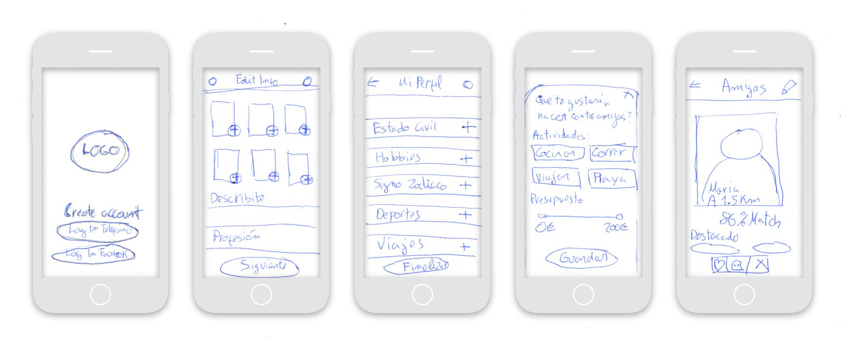
After deciding what kind of features we want to incorporate into the application we will start generating some lo-fi prototypes to start the project's ideation.
At this stage of the design process I like to use ideation workshops that help to create flows. The Google Design Sprint is a great way to bring together the entire team and stockholders to decide how to define the project.

Testing
We conducted a usability test with 10 Spanish women between 25 and 35 years living in cities. We use the same previous panel provided by usertesting.com
The middle note to the question: Would you like to use such an application? It was an 8.5
The middle note the question: How easy was it to complete the task? It was a 9
These were the qualitative results:
- I did not like the budget part. It doesn't seem necessary.
- I don't like the part about the zodiac because I am not interested in these things and it is not important in a friendship.
- I really like the "Matches" screen because it tells me what I have in common with a girl called Maria and what % I have in common and why. It is very simple and clear and there are options to connect with it if I want.
- The design is simple and clean. Minimalist I liked it that way.
- I like the color on the first screen. The design is very simple to use and I understand perfectly, I have no objections.
- I would like to add friends in common since I have logged in with FB.
- I wouldn't pay to use this app, but I wouldn't mind any ads.
- Maybe if I had a magic wand, I would put something completely new in this application that nobody has seen before, but I don't know what it would be.
Design
To develop the final design I always help myself with a "Design System", in this case I have used a system created previously by myself which I call Noodles.
I selected some feminine colours, a bluish violet and a pink, the decision was based on what are the favourite colours for this target. The typography selected was Axiforma.
Here you can find the prototype in Invision
Conclusions
It was a very interesting challenge to empathise with the user, since I am not the target of a product with these characteristics.
Highlights:
- The user is reluctant to pay mostly, but they would not mind encountering advertising.
- Most people associate this type of apps with DATING. There is a gap for a new niche.
- We must investigate what more innovative and differentiating features we can use to increase engagement.
- The girls want a safe place for them to be able to interact and organize activities together.
- Develop more extensive user profiles and add presentation videos.
Friend Signed Up App Design
Source: https://uxdesign.cc/ux-design-challenge-frenzy-app-to-meet-friends-e1e3de510dfb
Posted by: joneshany1989.blogspot.com

0 Response to "Friend Signed Up App Design"
Post a Comment